Develop performant blog with Qwik and Supabase
04. Integrate Tailwind in Qwik

In this article we will be looking at adding Tailwindcss to the project and configuring the fonts we are going to use by creating the first Qwik Component.
Topics
- Tailwind Framework Introduction
- Tailwindcss Setup
- Add fonts
- Conclusions
1. Tailwind Framework Introduction
Tailwindcss is a utility-first CSS framework and helps speed up the development of both prototypes and web applications.
Due to the large amount of classes that Tailwindcss contains we will have to write very little css and will be able to concentrate more on developing the logic of our blog.
The only disadvantage of Tailwind is the fact that, for complex components, it might be unreadable due to the high amount of classes however it is a good compromise because it still greatly reduces development time.
2. Tailwindcss Setup
Installing Tailwindcss on Qwik is very simple because Qwik will take care of generating the necessary files. To install it we run, within the app directory, the command pnpm qwik add tailwind.
Running the command will show us the changes that will be made and we can decide whether to proceed or not.
In this case we proceed by selecting Yes looks good, finish update! so that we can have the necessary dependencies installed and the files generated.
Of the generated files the only change we make is to modify the tsconfig.json file to include the generated files so we will have:
"include": ["src", "./*.d.ts", "./*.config.ts", "postcss.config.cjs", "tailwind.config.js"].
tailwind.config.js.
This is Tawilwind’s main configuration file where we can define custom classes or modify existing ones.
For more information about Tailwind configuration you can refer to the official guide Tailwindcss Configuration.
3. Add fonts
We will now go on to add two types of fonts:
- Pokemon Font: Font that we will use for titles and configure locally.
- Inconsolata: Font that we will use for text.
Of course you are free to choose the fonts you prefer 😉.
Let’s add the Google font that you can find here. I will use the Inconsolata font and the Pokemon font you can find here
In the file router-head.tsx we add the fonts:
...

const RouterHead = component$(() => {
  const head = useDocumentHead();
  const loc = useLocation();

  return (
    <>
      ...

      <link rel="preconnect" href="https://fonts.googleapis.com" />
      <link
        rel="preconnect"
        href="https://fonts.gstatic.com"
        crossOrigin="anonymous"
      />
      <link
        rel="preload"
        as="style"
        href="https://fonts.googleapis.com/css2family=Inconsolata:wght@400;700;900&display=swap"
      />
      <link
        href="https://fonts.googleapis.com/css2family=Inconsolata:wght@400;700;900&display=swap"
        rel="stylesheet"
      />
      <link
        href="https://fonts.cdnfonts.com/css/pokemon-solid"
        rel="stylesheet"
      />
    </>
  );
});

export default RouterHead;
router-head.tsx
Let’s add fonts in Tailwind’s configuration:
/** @type {import('tailwindcss').Config} */
export default {
  content: ["./src/**/*.{js,ts,jsx,tsx,mdx}"],
	theme: {
	  extend: {
		fontFamily: {
		  pokemon: "'Pokemon Solid', sans-serif",
		  inconsolata: "'Inconsolata', sans-serif",
		},
		fontSize: {
		  "pokemon-small": "4rem",
		  "pokemon-normal": "6rem",
		  "pokemon-big": "8rem",
		},
	  },
	},
	plugins: [],
};
tailwind.config.js
This way the intellisense will suggest font-pokemon and font-inconsolata when we type font and text-pokemon-* when we type text.
Now let’s deal with the creation of our first component with Qwik 😊. The first component is an atom and we will need it to render the Pokemon font correctly.
import type { LenientSVGProps } from "@builder.io/qwik";
import { component$ } from "@builder.io/qwik";

type Props = {
  text: string;
  length?: number;
} & LenientSVGProps<SVGSVGElement>;

const PokemonText = component$<Props>(({ text, length = 650, ...props }) => {
  return (
	<svg
	  {...props}
		xmlns="http://www.w3.org/2000/svg"
		style={{ width: "inherit" }}
		class={[
		  "text-pokemon-normal h-full fill-yellow-500 stroke-blue-900 stroke-2 font-pokemon",
		  `${props.class}`,
		]}
	  >
		<text
		  x="50%"
		  y="50%"
		  textLength={length}
		  lengthAdjust="spacing"
		  class="text-yellow-600"
		  alignment-baseline="middle"
		  text-anchor="middle"
		>
		  {text}
		</text>
	  </svg>
	);
});

export default PokemonText;
atoms/pokemon-text/pokemon-text.tsx
Let’s analyze the component. We created an SVG component so that we can change the style of the text by adding borders (stroke) and make the text as close to the original as possible.
In the Props we pass as a required field the text which will be the text that will be rendered and the length which stands for the length of the text.
The component$ function returns a JSX element and is the Qwik function for optimizing components by splitting them into chunks that are loaded only as needed. You can get more information in the official docs.
Finally, the element we return is an SVG containing the text to be rendered.
For all the components we are going to create, we add, in the component folder, a index.ts file containing export { default as PokemonText } from "./pokemon-text"; and a index.ts in the root of the atoms folder that exports all the atoms that we will define export * from "./pokemon-text";.
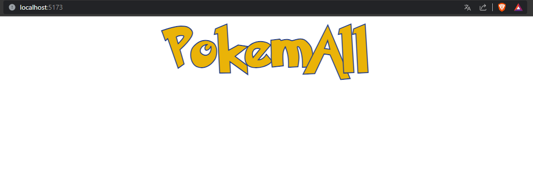
We are now ready to verify that the component is working properly. Let’s edit the home page file:
import { component$ } from "@builder.io/qwik";
import { PokemonText } from "~/components";

export default component$(() => {

  return (
	<div class="flex w-full justify-center">
	  <PokemonText text="PokemAll" length={420}  />
	</div>
  );
});
routes/index.tsx
Let’s launch the application and we’ll have our Pokemon-like text!!
4. Conclusions
In this article we saw how to configure Tailwind in a Qwik application, created our first component and integrated the fonts we will use in our blog . In the next article we will create the common layout for all pages with header, footer and content.
01. Project Overview
02. Design sitemap and template
03. Create project and strucutre
04. Qwik and Tailwindcss 👈
05. Build main layout | Cooming Soon